Deeper insights and easier analysis with XBRL data

Last week’s news story about FFIEC data got a lot of attention. That data – and an almost unlimited amount more, is also available to you! In this blog, our Guidance Manager, Revathy Ramanan, gives you some insights.
A wealth of public data is available in machine-readable XBRL format. Just a few examples include EU Annual Reports, US Quarterly and Annual Filings, Japanese Key Audit Matters, and in the near future a wide range of climate as well as broader ESG and sustainability data. It seems a no-brainer to harness the insights from the data that has come directly from companies.
As reported last week in our newsletter, against the backdrop of the ripples in the banking world over the last few weeks, we thought we would experiment with looking at another rich source of data in the US – the XBRL formatted call reports. Commercial and Savings banks in the US are required to submit a ‘Report of Condition and Income’ (Call Report) on a quarterly basis to the FDIC. The call report has a range of data that is focussed on the prudential oversight of the banking system. It covers a range of risks and exposures that go well beyond what is normally disclosed by (unregulated) companies, but are essential to understanding the health of regulated banks. Each disclosure can be analysed across time and against a range of peer grouping to draw interesting insights.
One such analysis is summarised in Figure 1. The view represents the maturity profile for selected Assets and Liabilities for ‘Peer Group – 1’ banks in the US.
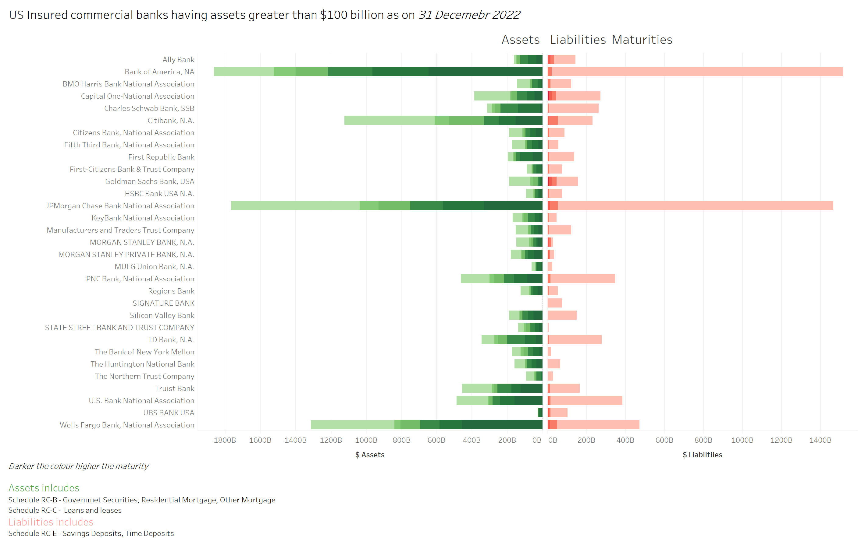
Figure 1
Of course, the asset/liability mismatch at Silicon Valley Bank hit the headlines, but in order to fully understand the ALM arrangements of these institutions, it is necessary to dig a little deeper and understand the interest rate hedging applied by each bank.
Keeping with the data in the news, you can just as easily use the FFIEC data to identify the current fair value of securities that banks report as “held-to-maturity” and compare it to the amortised cost as shown in Figure 2. Once again, to understand the full picture it is necessary to review the composition and diversity of liabilities (especially the deposit base) held by each bank, the interest rate hedging arrangements they utilise and the business lines that they offer. The point of the graph is to show that analysing the data is extremely straightforward.
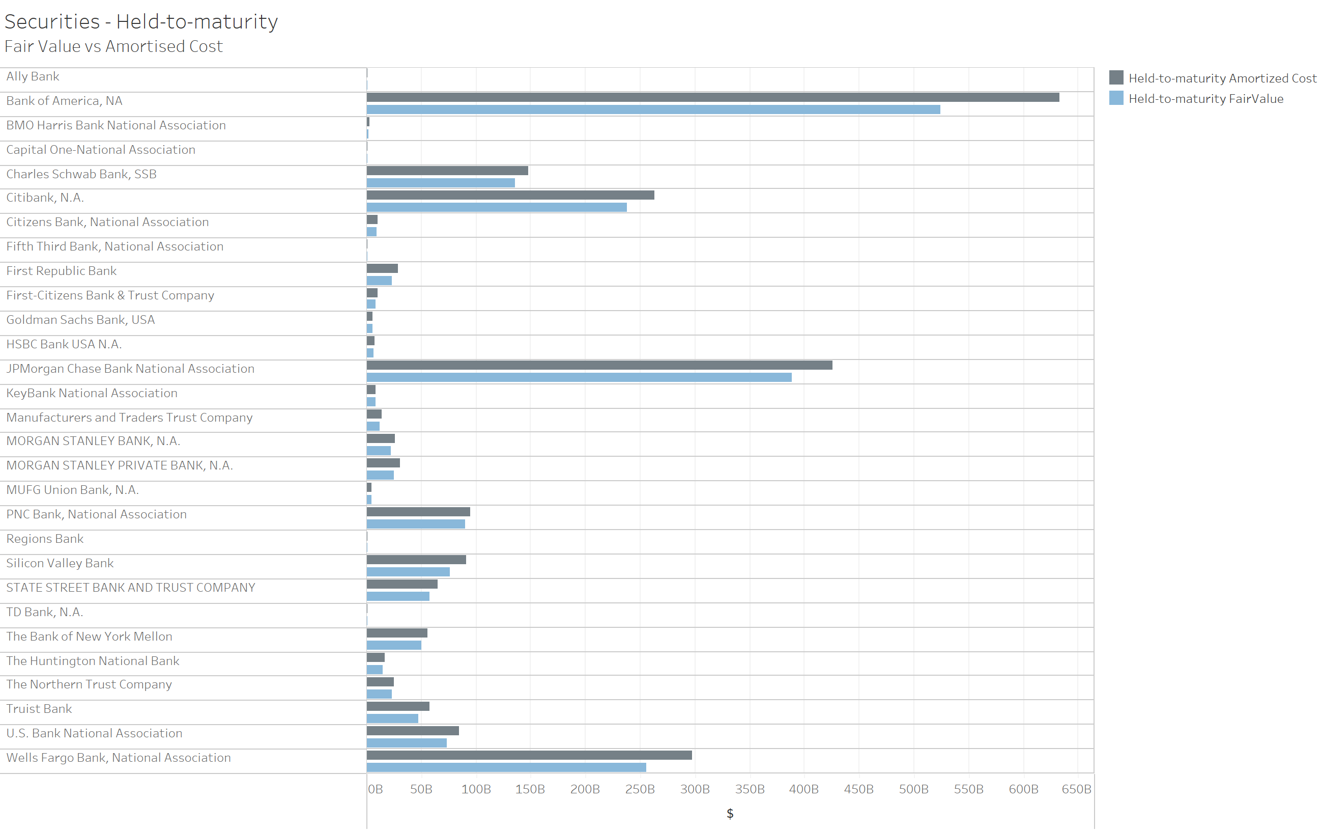
Figure 2
Access the interactive graphs here.
So… how is it done?
How did I go from XBRL reports to these data visualisations?
I downloaded the XBRL call reports for “Peer Group -1 Insured commercial banks having assets greater than $100 billion” as of 31 December 2022 from this FFIEC link. These reports are in the conventional xBRL-XML format.
The XBRL standard provides multiple interoperable formats for representing digital reports to address different use cases. I needed the reports to be in a format that third-party analytical tools (non-XBRL aware) can understand. xBRL-JSON is my friend here. xBRL-JSON is designed to make XBRL consumption easy.
The downloaded reports were converted into xBRL-JSON format using Arelle {Ed – Other tools that convert from xBRL-XML to xBRL-JSON are widely available}. These individual xBRL-JSON reports can be loaded into analytical tools that take JSON as input. Facts in xBRL-JSON are represented using a JSON object. Some tools (e.g., Tableau) may require the facts to be represented as an array, which standard JSON transformation tools can do. For ease of handling, I merged all these xBRL-JSON files into a data frame using pandas’ built in function in python. That sounds harder than it is! {Ed – Google “panda dataFrame from JSON files”}. The data frame was then loaded into Tableau – a data visualisation tool.
Relevant concepts were filtered and grouped to create the visualisations in Figures 1 and 2. The graph is presented bank-wise using the in-built XBRL dimensions capturing entity information. Each fact in the XBRL-JSON reports includes a concept name which, in this case, is an alphanumeric code representing a data point. For example, ‘RCON6810’ means ‘Money market deposit accounts (MMDAs)’. The graph, by default, shows the codes; the code was given a label alias for easy comprehension.
It took me about half a day to do the whole exercise, most of which was understanding the structure of the FFIEC disclosures. Once the report is set up, it is easier to analyse other parameters, such as credit losses and provisions.
The steps from XBRL reports to insights are straightforward, with xBRL-JSON facilitating data analysis in your choice of self-service analytics and BI tools. The message here is that it is easy to consume XBRL reports, and our expectation is that there will be more and more analytics, and more and more analytic tools broadly available that are taking advantage of xBRL-JSON.