Working with xBRL-JSON. An experiment!
XBRL’s new Open Information Model is a strategic initiative to simplify and modernise our standard. The OIM enables the free exchange of XBRL data across a range of different syntaxes. We are used to thinking of XBRL as an XML variant, but the OIM allows us to instead understand XBRL as a syntax-independent standard that isn’t linked to any one format. The meaning necessary to allow machine-readable reports and definitions is contained in the model. Different formats can be used to represent and exchange information that conforms to that model. I know, I know — it’s very “meta”. So perhaps it’s best to provide some examples.
I thought it might be interesting to experiment with xBRL-JSON, which is one of the new formats supported by the OIM. xBRL-JSON is a simple, standardised representation of an XBRL report using JSON syntax. JSON is a widely used syntax embraced by developers and programming languages for its simplicity and flexibility.
The technical work on OIM, xBRL-JSON and xBRL-CSV formats is almost finalised, and I am working on tutorials and guidance for business users to understand these new specifications. In this post, I am sharing the results of my small experiment in working with xBRL-JSON reports. The idea behind this experiment is to demonstrate the capability of xBRL-JSON reports to be readily understood by third-party applications without programming effort.
To start with, I downloaded a few quarterly XBRL financial reports from the Japanese EDINET platform. These traditional XML-formatted XBRL reports (now referred to as “xBRL-XML”) were converted to xBRL-JSON format using the Arelle open source XBRL processor. In the not too distant future, we expect that many systems that accept XBRL data in xBRL-XML will find it convenient to make data available as xBRL-JSON, which would avoid me needing to do this conversion step myself.
I then used the JSON files to create graphical representations using Tableau – a data visualisation tool. The visual representations shown here are not novel; we have seen similar ones done using the conventional xBRL-XML format; however, the difference here is agility and minimal coding skills with which these were set-up.
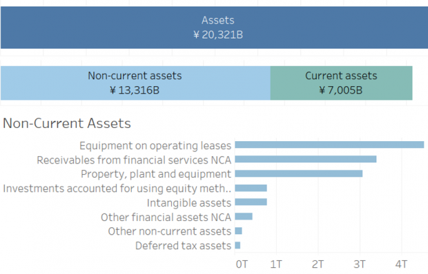
Figure 1 shows the breakup of different components of the balance sheet for “Honda Motor Co” as of 30 September 2019. The underlying numeric values in the graphs come from the XBRL report. An interaction was also provided to toggle between two periods reported.
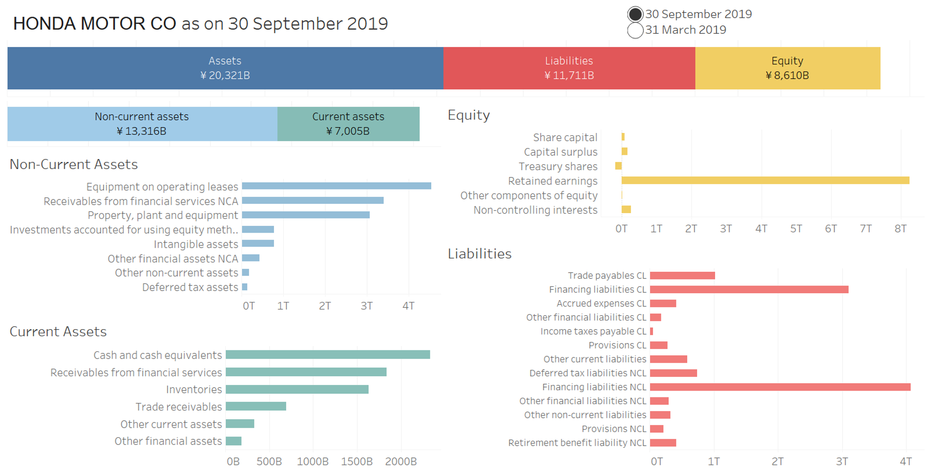
Figure 1: Balance Sheet Breakup
Similarly, I used extracts from the Income statement, Operating segment and Cash Flow statements to produce graphical representations of that data as shown below.
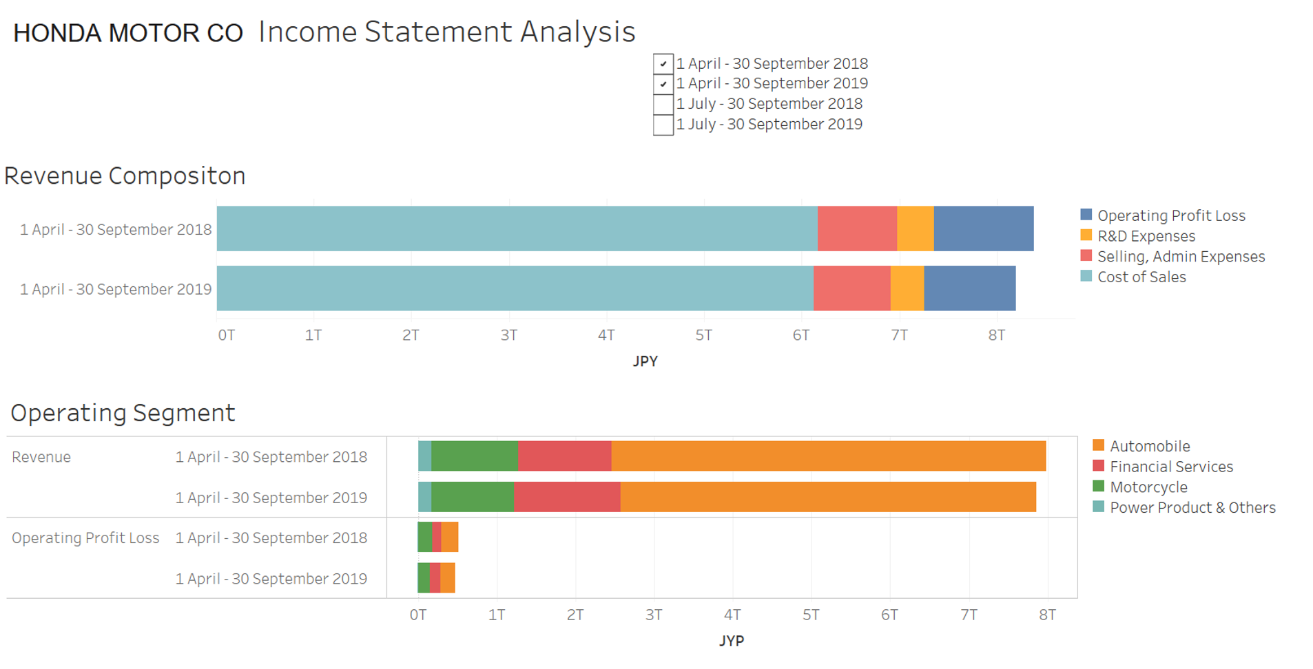
Figure 2: Income Statement Analysis
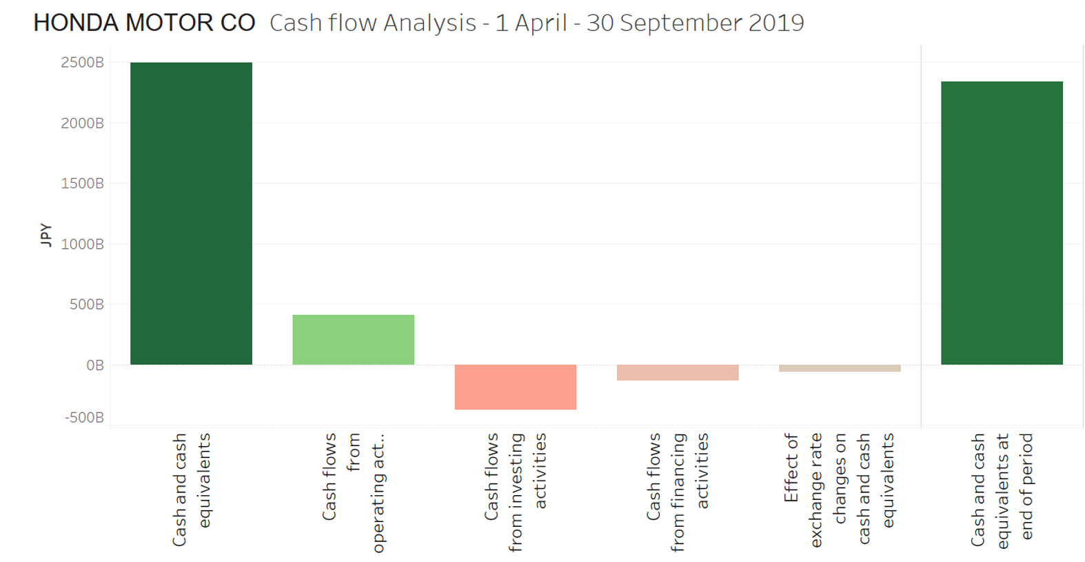
Figure 3: Cash Value reconciliations
Was it just a plug and play effort to create these graphs? Pretty much, yes! Mostly this was a drag and drop exercise, but it did involve a few set-up steps.
Firstly I needed to transform the JSON format slightly in order to meet Tableau’s requirements. Facts in xBRL-JSON are represented using a JSON object, with fact IDs as keys. Tableau does not support this arrangement, and so the JSON had to be pre-processed to represent the facts as an array. This is a simple operation which can be done with standard JSON transformation tools. It was also necessary to remove duplicate facts from the report in order to avoid double counting in the graphs. This was also easy to do as part of the transformation.
The concept names and period values were assigned alias labels to make them presentable, as people don’t want to read element names or ISO date formats. Concept labels should be an easy set-up once the taxonomy labels are in JSON as well (part of the next step in the Open Information Model).
Figure 4 is an example of what can be done by merging information from different XBRL reports, in which the balance sheet strength is compared across a few Japanese automobile companies.
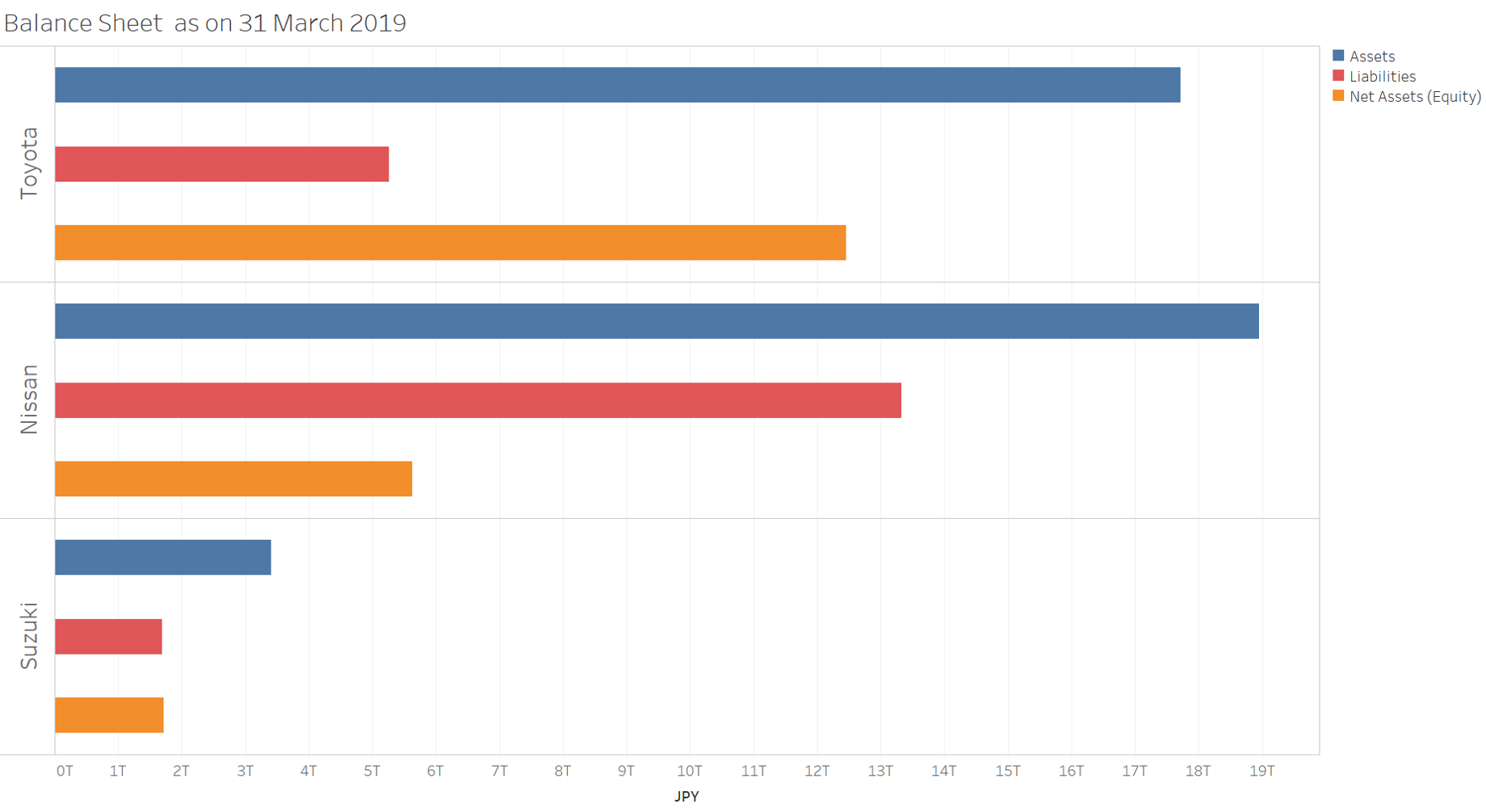
Figure 4: Key balance sheet figures across companies
With a basic understanding of XBRL report constructs and basic know-how of data visualisation tools, almost anyone should be able to create reports like these to enhance analysis. It took me about a day to come up with these visual representations, with a little more time to make them presentable for this blog post.
I’m pretty excited by this experiment. It proved to be one of the easiest and most straightforward ways of consuming data directly from XBRL, which after all, is one of the design goals for xBRL-JSON.
The larger point being driven here is xBRL-JSON is an easy to consume format, and the possibilities to leverage it are just waiting to be explored. In the age of self-service analytics and BI tools, xBRL-JSON can be put to efficient use directly by the business with minimal IT support. Equally, I expect a range of vendors interested in making XBRL analytics easy will achieve an awful lot with relatively minimal investment.
You can access and download the interactive graphs used in this blog post on Tableau: Honda Motor Co and Multi-Automobile companies.
Over to you! Have fun!
Revathy manages the development of guidance materials at XBRL International.